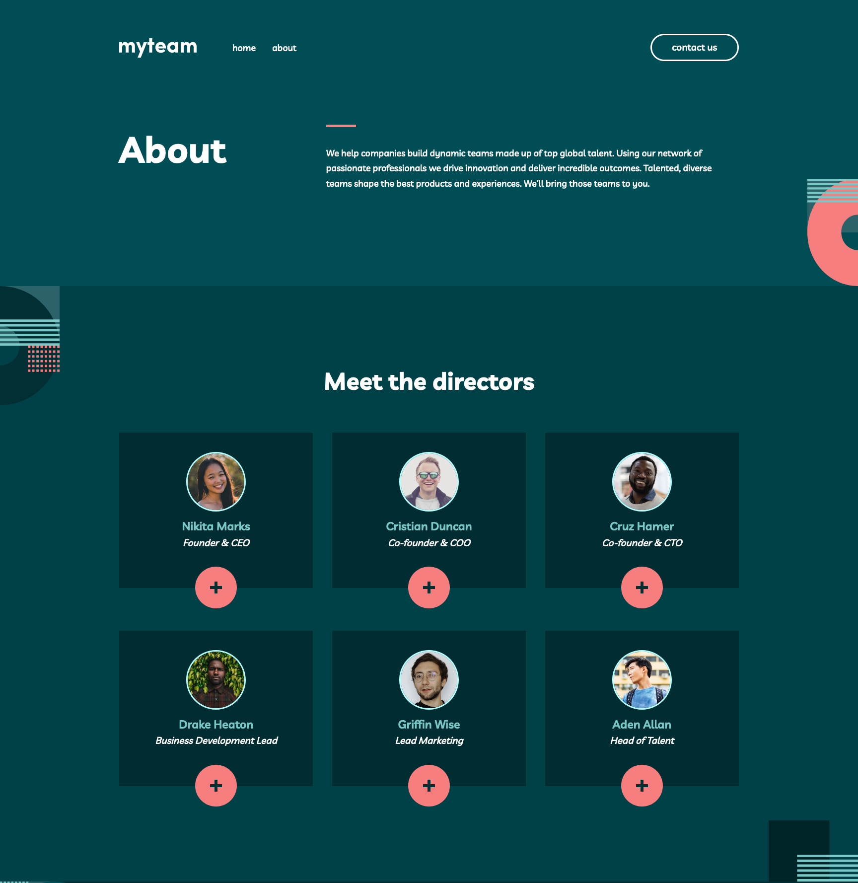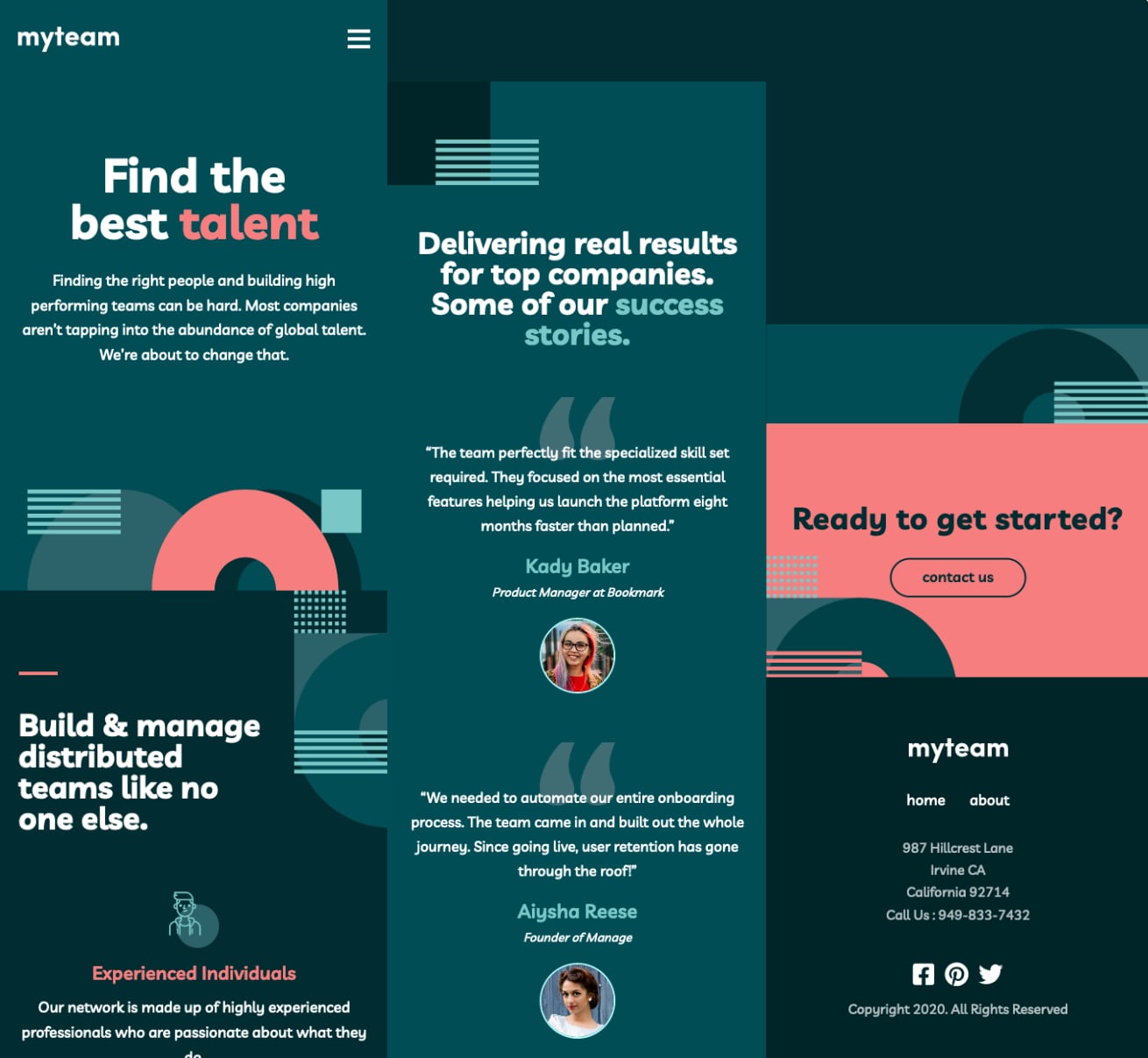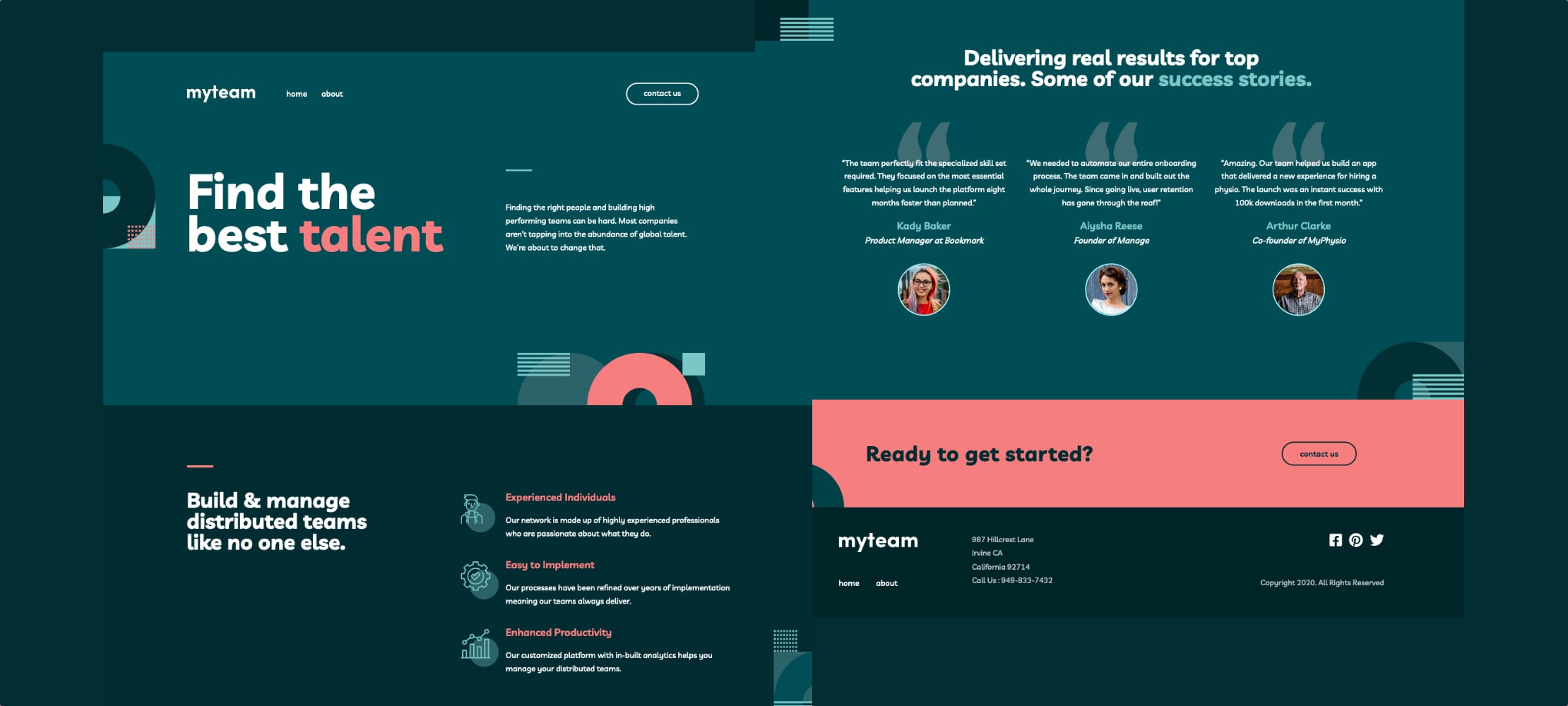
myteam
A fully responsive multi-page website built to the original design system. I focused on writing semantic HTML, whilst using SASS/SCSS, Grid, Flexbox and CSS custom properties for the layout. Font Awesome's CDN was used for the social icons, and TypeScript for the client-side validation in the contact form.
Visit website CodeProject Background
This project was a front-end challenge from Frontend Mentor and was my first attempt at recreating the design for a multi-page website. I focused heavily on writing semantic HTML and using that within TypeScript to apply dynamic styling, as opposed to the traditional classList API or data attributes. CSS-wise, this was also my first time building out a sidebar navigation for mobile devices, as well as making use of logical functions to create fluid spacing without the need for media queries. Due to an official tablet design being provided, my ideas for dealing with this viewport size have dramatically increased, such as allowing a longer line width instead of an increasing font size.
Static Previews